totw_logo_02Abstract:
This thesis is a reflection of the entire production process and learnings of Trials of the Wolf; an approachable roguelike card game about a wolf, created by Björn Lindholm and I over a period of almost two years. It was born out of our concerns about the endangerment of wolves as a result of poaching in Finland. It was my hope that by allowing for an underlying current of realism to exist within the game, some tangential learning would occur, allowing for players to empathise with their situation. The production was broken up into two major stages: pre-production, and production; my responsibilities being that of design, art direction, and animation. During pre-production, my goals mainly consisted of the background research on wolves as well as the necessary game benchmarking, prototyping, and documentation. Production was the development of the digital game based off of pre-production’s documentation and learnings. It was during this time the most pivots and learnings occurred when evaluated against the entire production. At the end of the production we were able to deliver a vertical slice of the game which entailed our initial production goals: creating a game that was difficult but still approachable with factual undertones. It is my deepest hopes that my research and learnings from this thesis can be used as a guide for others looking to develop their own digital games with a small team and limited resources.

Thesis:
The Production & Learnings of Trials of the Wolf

Alpha Builds:
– Read Me
– Mac 32 bit / 64 bit (Offline)
– PC 32 / 64 bit (Offline)
– Linux (Offline)

Credits:
Developed by Arash John Sammander and Björn Lindholm
Art by Matei Molner
Music by Vesa-Matti Mattsson

Aalto University (TAIK), Master Thesis

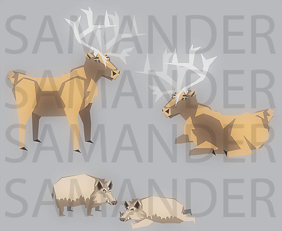
MA Thesis Diary Post #6 – Caribou and Boar

Woke up early today, it was so freaking dark and it was 8:30am.  Found out the Sun didn’t rise for another hour and woke back up around 1:30pm 😛  Helsinki only has about 5-6 hours of sun light during winter, so you gotta be careful not to sleep too late or you miss any and all light that might be in the sky.

I was able to still get two animals done today the caribou and the boar.  I wanted to do the moose and the caribou today, but the caribou’s antlers pissed me off so much; I decided to skip another antlered animal for today.

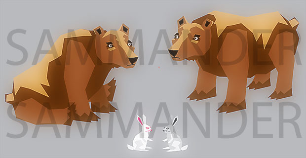
I also reworked some of the colors of the musk ox but I won’t be posting that today.  I’ll probably do a group post of all the animals when I’m done them.

CaribouAndBoar

Standard
Aalto University (TAIK), Master Thesis

MA Thesis Diary Post #3 – Assets, Assets, Assets

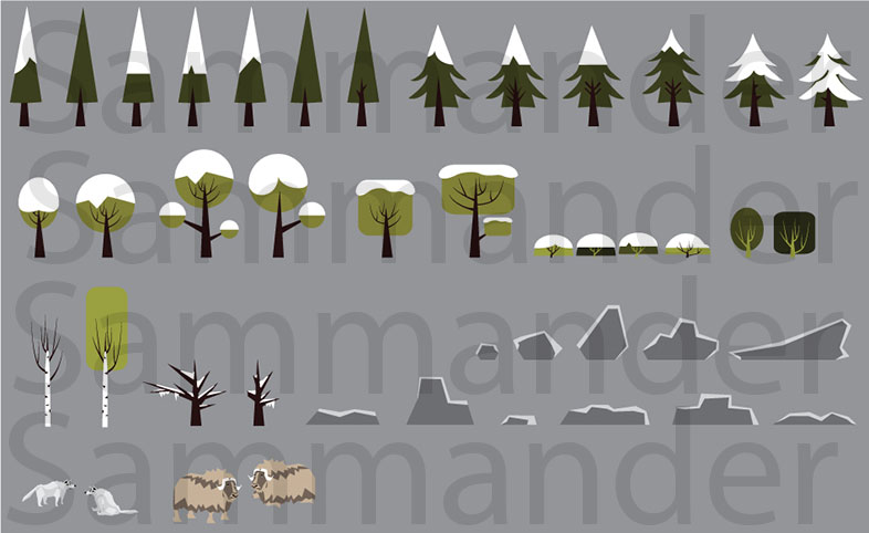
The benefits of being alone during the holidays is that you have nothing better to do than get work done. 😛  Here is the result of the past few days of work:

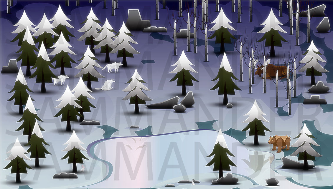
With the worries of art style, perspective, and animation out of the way, I was able to spend the last three days working like a dog or wolf, and was able to produce the follow early draft work.  As you will see, initially I straight up copied Matthew’s tree style but then eventually broke off and began to reinterpret and add my own spin on things.  I think that is a big step for many non artists to understand, they think that if you are using someone else’s work as a reference it is somehow cheating, when in fact it is not.  Of course I will not be using all of these in the final product to be safe but either way I am extremely thankful for finding Mr. Curickshank’s work.

You will also notice I was able to eventually develop my own bushes, and trees based off of this style.  Finally I created some rocks and the wolf and musk ox to see how they fit together in this world, again only caring for 2D profiles and trying to limit myself to only 2-3 colors.  Doing front and back will be more difficult, especially if it becomes a 2.5D / 3 quarters view later on.  For now I’m going to just keep with this so I can keep moving forward.

ArtAssetsWolfGame

Standard
Aalto University (TAIK), Master Thesis

MA Thesis Diary Post #2 – Reworking Art Direction

To address some of the issues that I have been having when creating art assets for the game I sat down and really thought about why I was having so much trouble actually creating them.  While I was thinking I thought long and hard why I was struggling so much.  I knew that I had enough skill and ability to at least produce something reasonable, so why was it that I could not do a thing.

After thinking for a while and talking with my collogue I came to the realization that I have not produced anything out of laziness but more because of the type of artist that I am.  There are many different types of artists with many different skill sets.  They have many different strengths and weaknesses.  There are some that have very unique styles and can always easily create imagery in that style.  Others art “styleless” who cannot create anything completely from their minds, but must see examples of what they need to create.  I fall into the later category.

I was having such a hard time creating art assets because two key things were missing, an art style, and examples.  After being forced by my collogue to address these issues by picking something and sticking to it I came to the following choices.

The art style will be simple and vector based (at least initially) because this is where most of my skill lies, two it should be simple so that I do not fall into the habit of trying to create highly realized (overly realistic) imagery.

Earlier in the week google had done a nice “interactive” story telling about the Brothers Grimm, which had a nice simplistic graphic style, which was done by Matthew Cruickshank.  Something about its simplicity had caught my eye and I really enjoyed how he was able to tell so much with so little.  After talking with a few artists at work, various artists and some 50’s – 60’s children’s books were suggested.  Finally the art of Josh Agle, better know as Shag were also recommended.

Taking these into account but leaning more towards Cruickshank’s style laied the foundation of our art style.  Now with that out of the way, we came across my other problem.  Since I could only create what I saw and now that I had a lot of reference, none of them were rendered from above but only from the side.  Again this was one of the biggest challenges I have had, seeing something then trying to imagine it from above.  It really twists your brain.  I could have of course created or found 3D models, then orbited around them to get the angle and look that I wanted but even this would take too much time.  So Björn and I decided that we will now just worry about a side (or semi-side view).  This made things a lot easier cause I just had to copy what I saw instead of try to imagine it.  Also I was told to ignore animation (one of my other weaknesses) for now and if and when the time comes that I could not do it, then we would hire someone to handle the animation.

And so my work began…

Standard
Master Thesis

MA Thesis Diary Post #1 – Early Tree Concepts

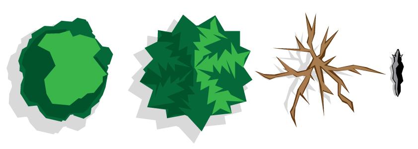
Over the past year I’ve been working on iterations of my MA thesis that I and Björn Lindholm are collaborating on.  Though I’ve spent many days iterating on various designs and art styles I believe that I will probably be going for a more clean vector style which only uses 2-3 colors max per object.  Below is an example of some early concepts:

TreeConceptsFinal

As I continue to work I will post more images and discuss my progress.  I will continue now to iterate more landscape objects as well as work on more iconic representations of objects which will be used in another portion of the game.

Standard